Sorting
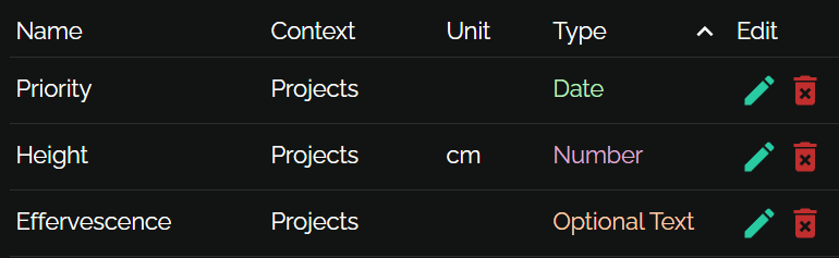
User just clicks column header. Secondary and tertiary ordering just works.
rx-datatableLists, trees and treeable tables for React with pluggable reactivity and theming

User just clicks column header. Secondary and tertiary ordering just works.
You pick a size; user can resize. Unclaimed space is distributed among columns.

A table and tree at the same time. Write it how you want: as a function that gets each item's parent, or as a function that gets each item's children. Children can be collapsed.
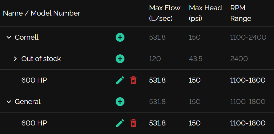
Use different row configurations to support multiple data types in the same table
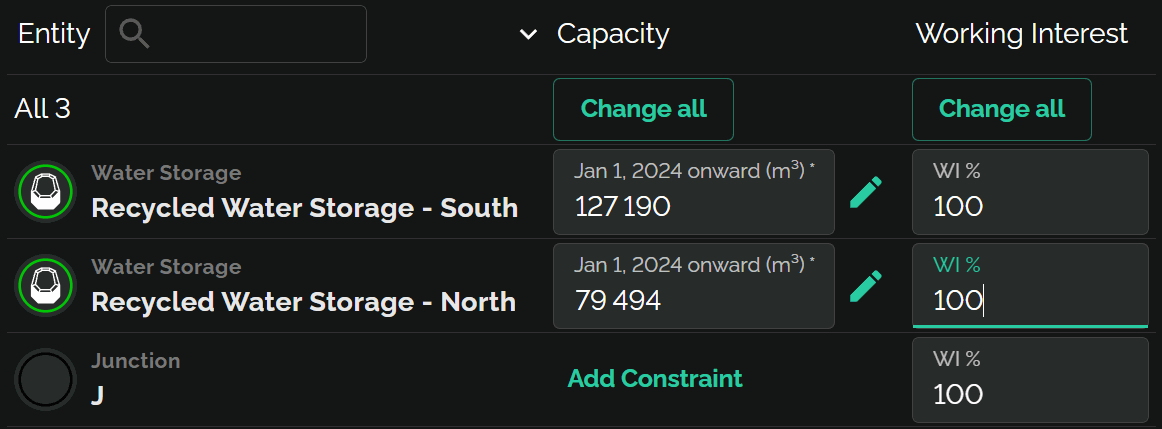
In this example, the first row has value null
which is rendered as a special "All 3" row
Up to 10,000 rows
virtualization delays rendering to improve perf, but it's
not designed for huge datasets
DataTable is built on simpler ListBox/TreeList
components
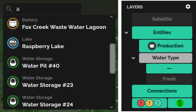
Unlike some systems, you can style DataTable with CSS like anything else
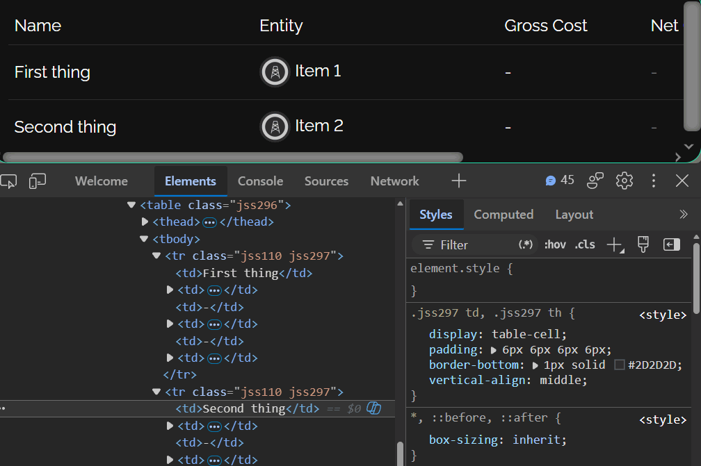
It's just normal React content
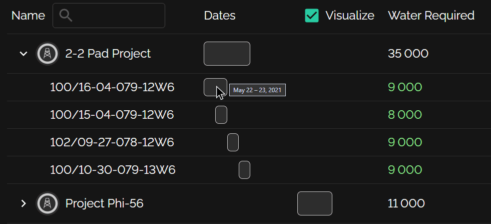
Just use position: 'sticky' in the style of the column's
cellProps. Merge cells horizontally with getColSpan.
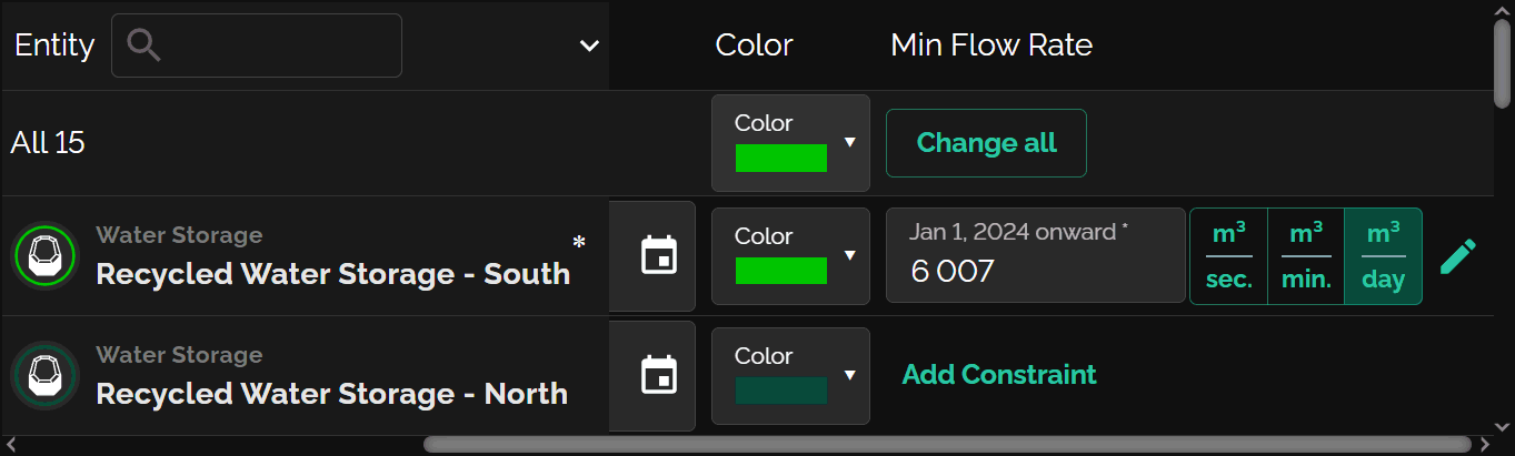
Try them below — color schemes and metrics (spacing, tree indent) are separate, so they mix and match with one line of code.
Pluggable reactivity system supports MobX directly; some assembly required for other systems.
Loading demo…
import { DataTable } from 'rx-datatable';

export function Numbers() {
    return (
        <DataTable<{n: number}, number>
            list={[ { n:3 }, { n:4 }, { n:5 }, { n:36 }, { n:16 }, { n:100 } ]}
            selMode="multi"
            columns={[
                {
                    name: 'n', heading: 'Number', isTreeCol: true,
                }, {
                    name: 'Square',      getValue: (item: {n: number}) => item.n * item.n
                }, {
                    name: 'Square root', getValue: (item: {n: number}) => Math.sqrt(item.n)
                }, {
                    name: 'Odd?',        getValue: (item: {n: number}) => (item.n & 1) !== 0
                },
            ]}
            getParents={item => {
                let root = Math.sqrt(item.n);
                return root === Math.round(root) ? [ { n: root } ] : undefined;
            }}
            getSelKey={item => item.n}
        />);
}
See the manual for the common usage patterns (plain tables, tree grids, multiple row types, theming, MobX integration), and the API reference for every export, prop and type.